 20 Terms
Home > Terms > 크로아티아어(HR) > Gap-ov znak
Gap-ov znak
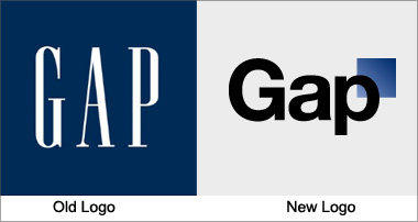
Gap has used the same logo for over 20 years, instantly recognizable with its stretched, white letters against a navy blue background. Yet the company recently released a new logo, created in collaboration with the customer community, to widespread indignation. It has been called a “Microsoft Word” creation and a “prototypical brand panic move”. Gap is already rethinking the change.
0
0
향상
하고 싶은 말
뉴스 속의 용어
추천 용어
phylum placozoa
Macroscopic, flattened marine animals, composed of ventral and dorsal epithelial layers enclosing ...
phylum cnidaria
Cnidarians. Hydras, hydroids, jellyfish, sea anemones, and corals. Free-swimming or sessile, with ...
share a term with millions
Share a term with millions of users around the world and increase your online visibility.Share a ...
oak
Genus native to the Northern Hemisphere with spirally arranged leaves, catkins for flowers and ...

Everest
The last but not least mount Everest. The Earth's highest mountain, with a peak at 8,848 metres ...
aglaonema
Genus of about 20 species of usually rhizomatous, evergreen perennials from tropical forest in Asia. ...

Robojelly
Robojelly is a hydrogen-powered robot desgined in the United States that moves through the water ...
Ferdinand Porsche
Ferdinand Porsche (3 September 1875 – 30 January 1951) was an Austrian-German automotive engineer ...
Marzieh Afkham
Marzieh Afkham, who is the country’s first foreign ministry spokeswoman, will head a mission in east ...
주요 용어사전
Browers Terms By Category
- 쌀 과학(2869)
- Genetic engineering(2618)
- 일반 농업(2596)
- 농업 프로그램 & 법(1482)
- 동물 사료(538)
- 낙농학(179)
농업(10727) Terms
- Film titles(41)
- 영화학(26)
- 영화 제작(17)
- 영화 종류(13)